OLIVER TWIST (1948, Lean)
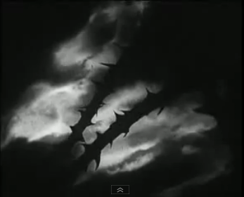
This is a quick shot by David Lean, a real favorite of mine. He famously did two letter-perfect adaptations of Dickens’ work – Oliver Twist and Great Expectations, and today’s shot shows what a great visualist he was. Lean loved to figure out ways to visually express complex ideas in his films. For instance, when making A Passage to India, he was particularly torn on how to visually express Peggy Ashcroft’s character’s existential crisis that E.M. Forster suggests. (Reflections of the moon in her sunglasses became the abstract and curious image he came up with to express that. Admittedly, it wasn’t his best reviewed film.)
Lean’s work in today’s post is a bit more poetically direct and certainly more effective. It’s from the top of Oliver Twist, a sequence that was hard won, as Dickens’ opening in the book is decidedly un-cinematic and therefore had to be re-invented.
Dickens wrote, “…and in the workhouse was born on a day and date which I need not trouble myself to repeat, in as much as it can be of no possible consequence to the reader, in this stage of the business at all events, the item of mortality whose name is prefixed to the head of this chapter.”
Try turning that into a scene.
David Lean gets a little help from his friends
According to the incredible (and refreshingly honest) biography on Lean by Kevin Brownlow, Lean and his co-writer Stanley Haynes could not, for the life of them, come up with a suitable opening. Frustrated, they held a contest at Pinewood Studios. Only one person accepted the challenge, actress Kay Walsh, who had been cast in the role of “Nancy,” had acted in Lean’s previous three films and assisted in writing the adaptation of Great Expectations. (Incidentally, in my 6th grade year book, I answered the question of where I would live when I grow up with “Pinewood Studios.” Still working on that.)
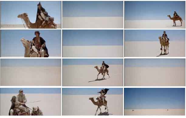
What she wrote was nearly verbatim of what appears in the opening of Lean’s film. My favorite, most evocative moment, has to be the pain and duress that he is able to convey by way of one brilliant cut-away. This shot – the contorting, prickered stems – is abstract, yet very cool and effective. (It’s a visual that Lean would return to; Lawrence’s death in Lawrence of Arabia comes to mind, when his goggles end up in just such a bush.)
The moment is at 2:27 – ooo, child, that woman’s got the misery up in her back. (I also love the reveal of the word “Parish Workhouse” with the lightning strike at 4:07!) Amazing what an imaginative visual metaphor can express.
[youtube=http://www.youtube.com/watch?v=oSjwyfdfGOA]


Carlos
Very cool. Even though I’m a digital geek, I really love the rear projection effect in these types of film. Makes the composite clear and with no hassle. Perhaps I should look into rear projection in my next project? Maybe it will cut my costs in half?
I’m really getting a kick out of these posts John. Not only do I learn something, I go out and watch something I haven’t watched yet.
jsbfilm
That would be amazing if you did some rear projection. It’s still done today precisely because cut costs. Try it!
Pingback: SUNRISE: A SONG OF TWO PEOPLE (Murnau, 1927) | shot4shot