SUNRISE: A SONG OF TWO PEOPLE (Murnau, 1927)
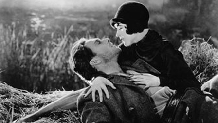
Watched this movie the other night on a beautifully restored blu-ray transfer. For its time, the visuals in this film must have been startling and arresting. In fact, it won an Oscar at the first Academy Awards, for “Unique and Artistic Production.” The layering of images, possibly the most notable part of this film’s place in cinema history, perhaps inspired the lush visual tapestry of Coppola’s Dracula (for proof, check out what happens in the Dracula video, second youtube below, at 2:35.) Sunrise‘s sub-title uses the word “song” within it, but it easily could have used instead: “poem.” The visual beats of the story so boldly evocative in their imagery.
Check out this gorgeous tracking shot, with the studio feel of German expressionism, which suggests a fable or fairytale is unspooling before us.
I particularly liked this first shot (first on the above youtube, but about 10 minutes into the movie), when the man walks heavy-hearted through a moral (and literal) quagmire, through thick and craggy branches, over a fence, into uncharted territory, into real DANGER, only to end up at its source when the “other woman” is revealed – cloaked in trees, darkness, and that sinister hat, as to appear a lurking spider in the moonlight, indeed a black window. This is Great visual storytelling; the images vividly portray the inner life of this man, his state of mind. It reminds me of the opening of David Lean’s Oliver Twist, very similar states of despair, visually communicated.
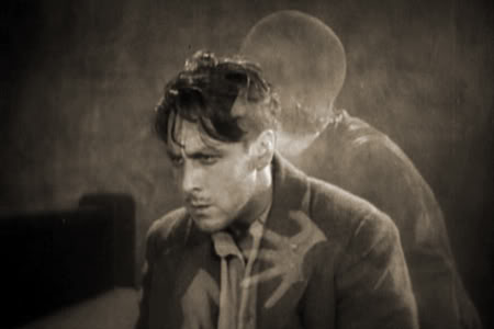
She’s so creepily cloying. Later, when they’re apart, she appears again as phantoms of the trapped man’s longing, in this ground-breaking optical shot (which gets referenced by Coppola about 70 years later, see below):
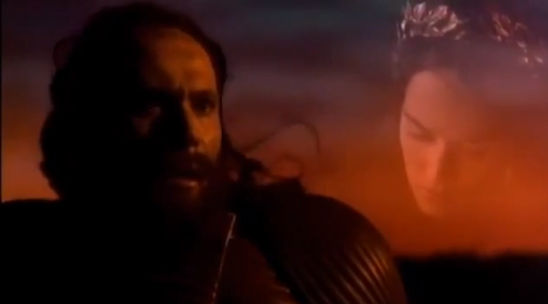
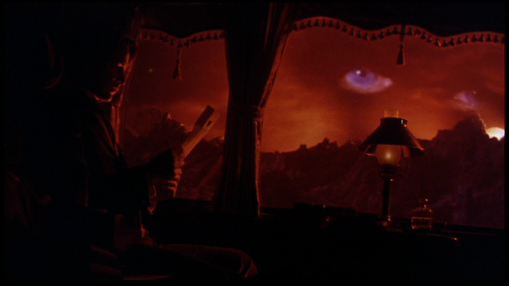
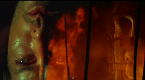
Compare to clip below at 2:35 –
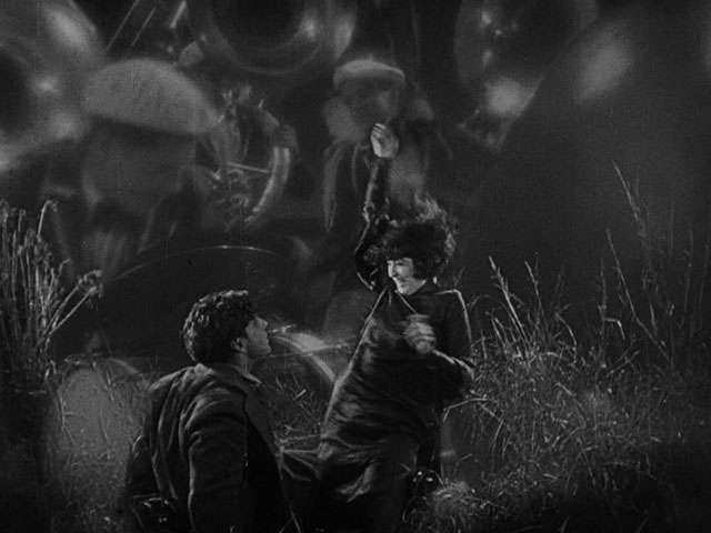
This type of superimposition of images is what’s spoken about most in regards to Sunrise, but I was surprised just how infrequently it’s actually used in the film (it’s certainly not throughout), which speaks to just how powerful an impression these moments must have made. In another use of the technique, earlier, the Woman from the City (Margaret Livingston), and the Man (George O’Brien) dream of the gay times they’ll have in the big city as the images swirl around them (you can see it in the above video at 3:33) –
Murnau’s influence on Coppola’s Dracula
Back then, it must have felt like a whole new kind of storytelling. This type of poetic and visually dense style isn’t used all that frequently, and it got me wondering why. Do we lack the artists with appropriate boldness, or is this style simply out of style, passé? Perhaps because of the influence of ‘minimalist” story telling, or increasingly drab and pervasive ‘Hollywood Realism’ that requires only a master shot, single and reverse and forbids anything that steps anywhere near the realms of poetic delirium. (“Mustn’t challenge or confuse the viewer in this television-dominated age that must adhere to the restraints of running time and intellect.”)
One contemporary example that feels the closest to me, would be the above-mentioned Coppola film, Dracula, which heaps on layer upon layer of lush visual poetry, perfectly reflecting the theme of the characters’ struggles with mortal decadence and existentialism. Plus it just looks so cool. You’ll see a really strong reference to Sunrise at 2:30!
If anyone can think of any other examples, please let me know, as I’d like to explore this style more. Meanwhile, just for fun, in case you missed the link above, here’s the richly operatic opening to Coppola’s Dracula:
