VERTIGO part 2 (1958, Hitchcock)
As promised, we’re back for one more shot from one of my favorite Hitchcock films, Vertigo. This shot really knocked my socks off when I saw it in the theater last year at the Egyptian in Hollywood. (I really should go back there and find those socks.)
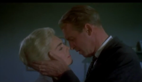
It’s another really assured moment. This one, for some reason, reminds me of Sergio Leone in its boldness. I guess because it’s just so out there, while still so emotionally effective. For the sake of revealing minimal spoilers, let me set it up this way: [Minor Spoiler alert] Stewart is in love with a woman, Madeline, who’s now dead at this point in the film. When he comes across her doppelganger (also played by Kim Novak), he begs her to dress up as his former love and then kisses her. Sounds healthy enough. I mean, if I had a nickel.
The shot is here at 1:10, but as usual, you got to watch the whole thing! Once again Hitchcock plays the suspense, building it as we await her grand reveal, now dressed like (dead) Madeline. We’re right there with Scottie in anticipation. (Hitchcock described this moment to Truffaut as Scottie metaphorically waiting for the woman to undress and come out naked, that Scottie is getting an erection in this waiting. True story.) Then there she is, at first revealed as a ghost as Bernard Hermann’s crazy gorgeous score hits us now full-blown with the same theme we first heard – only timidly – in that restaurant when they’d first met. (For that scene, see this post here.) Hope you’ll watch this video before reading on:
Hitchcock sends us back in time
In this one shot, Hitch throws us into the emotions of an obsessed man, shooting us back in time & space from the neon-sign-lit hotel room to the livery stable at Mission San Juan Bautista where he’d kissed Madeline for the last time and declared his love.
For me, this moment resonates so well because it’s a surprising and wholly unexpected peek into our heroes psyche and, technically — ie camera work and staging — it’s just so damn cool. I had two different reactions to this shot upon first and then second viewing.
Sitting in the Egyptian, I found it so heart-rending that Scottie would be obsessed and hung up on that last intimate moment with her – but nothing’s ever been said about this before in the film. It’s like a surprise and truthful glimpse into his head that makes total, heartbreaking sense. We’re able to deduce all this on our own. We go back to this moment because Scottie is trapped in the past (the main theme of the whole film), and as an added-bonus detail, an antiquated buggy is just the symbol for that. I love that Hitch conveys all this with a bold, unexpected use of silent staging and (even then) old school in-camera special effects.
But then sitting at home watching the blu-ray, I had a different response. Maybe it’s because I knew it was coming. Suddenly the moment in this shot when Stewart seems to realize his surroundings jumped out at me (1:36 in video above). Has this kiss been her undoing, is it in this moment that he realizes exactly who she is, that it’s the exact same kiss from the stable? Is he connecting the dots, realizing that perhaps it’s no mere coincidence this woman is the spitting image of Madeline? (I love that he soon doesn’t care – back to the kiss!) Again, all conveyed in one “silent” shot.
How about the whole scene being bathed in green light? (Green often associated with the supernatural, brings to mind the ghost in David Lean’s Blithe Spirit.) Green is Novak’s characters’ color and the room in this scene is drenched in it, the color of the iconic dress she wore in the red restaurant when she was first revealed! (see this post here) Hitch’s carefully designed visual cues all point us in an evocative direction – cutting out the middle man, the conscious brain, and going straight to the emotions.
Oh, silent cinema, how I love thee.
P.S. I just came across this and had to add it as a bonus. Get a load – Hitchcock created these repeating editing patterns to demonstrate the emotional loop that Stewart’s character was stuck in. Someone thankfully cut them side-by-side:
DELIVERANCE (1972, Boorman)
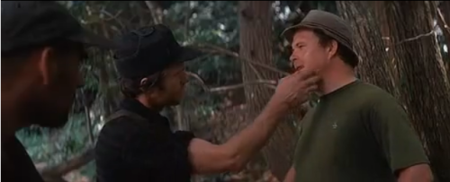
No dueling banjos in today's shot, but it's no less creepy. Here's an example of a oner that builds incredible, terrifying tension in no small part because it's unbroken. Now, I don't think it's entirely successful, I'll explain in a
VERTIGO (1958, Hitchcock)
Like the previous post about Scorsese, this shot is staged with great originality and really bares the stamp of the director. Kim Novak's famous entrance in the film is so simple, restrained, elegant, and full of weight. The placement of
Jeremy Cole
I think you’re right on, John. It’s been a long time since I saw Vertigo and I never really made a study of it, so this was fun.
I’m not sure how he achieved such smooth transitions tracking around them during the kiss — between the dark world of the old buggy and the lighter room. All lighting? No matter how he pulled it off the idea is just plain elegant in its economy and its effectiveness. Plus, like you said, it’s always so much more satisfying when we feel like WE put it all together.
That green lighting has GOT to be there to evoke the supernatural, which makes it a natural choice to be “her color”. In fact, I’m seeing something in the shot where she first comes out of the doorway that tells me Hitchcock is going after that spectral feel but I don’t quite get how he did it.
Check out the shot at :13, :22, and :25 (Kim Novak getting closer and closer). At :13, you’ll see there’s a graininess/milkiness to the image area bounded by the door frame and the tone of the carpet at her feet is washed out. It’s there again at :22 but less so (notice he cuts before she crosses the boundary of the doorframe). Now compare this to :25. Looks normal. Your first post on Vertigo talked about the light behind Novak changing in the restaurant. Seems like this is the sister effect to that one but to my eye this one doesn’t look like lighting alone. It looks like an effect. Anyone know?
Obviously, having a character cross the room doesn’t require a special effect but it looks like he went out of his way to place a mirror or use some form of optical printing/matting. However he did it, I think he was aiming for a transformation- trying to bring her into the regular world from a surreal/spectral place (hence the three steps/looks).
Thanks for you post on this. It got me thinking. Always some good lessons for us to cull from Hitchcock!
Mike Blasko
There is a 70mm LPP restoration that does NOT do this scene justice in terms of over saturation and contrast. But the DTS is nice !
The tech prints that are out there are a whole different story. But the 70mm is a sight to see.
Jeremy Cole
Thanks for your note on the P.S. about the parallel editing. That’s a fun split screen.
I remember one of the first books on directing that I ever read talked about using similar framing of the same subject as a “call back” device. This is the motherload of call backs! And now that I’m reminded of the framings of Novak in earlier scenes, the profile framings from your first post make perfect sense.
jsbfilm
I know – it’s crazy! Makes me so happy. And really amplifies the impact of the profiles, and the his seeing her in the windows, etc. Yeah, that ghost effect in the hotel room is rad. Again, it’s so out there. He goes for it – she’s a ghost in Scottie’s heart, and also here. Very inspiring, all in all, no?
R Poe
Just downright surreal, most of it. And of course the way he used color – what were these shot in, technicolor? So beautiful and dreamlike.
jsbfilm
Totally agree, Rob. Yes, shot in Technicolor and VistaVision. Man, I’d love to see an actual Technicolor print of this film. I found this excerpt from this great essay –
http://www.stevenderosa.com/writingwithhitchcock/fromthearchives.html
Audiences in 1958 got to see Vertigo printed in IB Technicolor. The color process in which colored dyes – yellow, cyan and magenta – are actually placed on the film. The beauty of true Technicolor is obvious to anyone fortunate enough to see a screening of an archival print in a revival house or museum. During their Hitchcock retrospective last spring, the American Museum of the Moving Image in Astoria, screened an original 35mm IB Technicolor print of Vertigo. The print, while suffering some signs of its age (1958), was quite beautiful to see. There were colors and subtleties that I had never seen before in any of the 1983 release prints.
derm exclusive a
Gοod info. Lucky me I recently fօund уour website by
accident (stumbleupon). I’ve bookmarked it for later!
John F
Green is the color of nature. It symbolizes growth, harmony, freshness, and fertility. Green has strong emotional correspondence with safety. Dark green is also commonly associated with money.
Green has great healing power. It is the most restful color for the human eye; it can improve vision. Green suggests stability and endurance. Sometimes green denotes lack of experience; for example, a ‘greenhorn’ is a novice. In heraldry, green indicates growth and hope. Green, as opposed to red, means safety; it is the color of free passage in road traffic.
Use green to indicate safety when advertising drugs and medical products. Green is directly related to nature, so you can use it to promote ‘green’ products. Dull, darker green is commonly associated with money, the financial world, banking, and Wall Street.
Dark green is associated with ambition, greed, and jealousy.
Yellow-green can indicate sickness, cowardice, discord, and jealousy.
Aqua is associated with emotional healing and protection.
Olive green is the traditional color of peace.
jsbfilm
Thanks, John! You know a lot about green.