THE KING’S SPEECH (2010, Hooper)
Tom Hooper (director of HBO’s His Dark Materials, which in fact does not use these types of negative-space compositions) got a lot of use of oblique camera angles in this movie as well as in HBO’s John Adams. In both cases, Hooper used them arguably on point thematically. Watching His Dark Materials, it’s not hard to imagine that these type of extreme compositions didn’t fit within the themes Hooper was exploring. I’ve experimented with this in my work too, and its interesting that certain scenes will take to it naturally and some will flat out fight it. So there’s a time and place for this for sure.
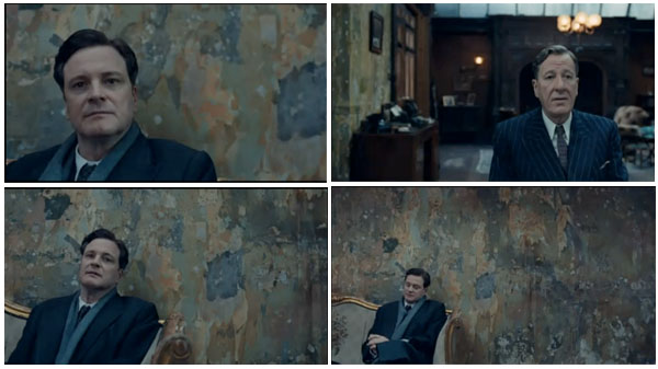
Much has been said of the camera work from the impeccably crafted The King’s Speech when Bertie first meets with Logue in his dingy office. I noted it upon first viewing, and came up with a few theories of my own and had many a conversation about it with my filmmaker friends.
My first inclination was that the walls around Bertie remind us that he is a slave to the royal institution – that the social structure all around him is an oppressive and ever present force. The ragged walls also feel jagged, like his speech. And his affliction has taken him from his posh comforts, internally and externally. All that to say, the image feels pregnant with meaning, and in this scene, that’s a good thing.
Hooper Explains The King’s Speech Composition
I got to listen to director Tom Hooper at the DGA symposium of nominated best directors for 2010 (he would win), and hear is his explanation:
On the esoteric side, he said he wanted the negative space around Colin Firth to visually represent the painful emptiness Bertie feels when stuttering – those awkward, hanging pauses that torture someone just trying to express themselves. (The texture of the wallpaper I think adds to this, though I don’t think Hooper commented on that specifically.)
On a more practical level, he wanted to visually suggest the discomfort between Logue and Bertie, by filming them in starkly contrasting and disparate, unnatural compositions. As their relationship grows throughout the film, the shots grow more and more properly composed and comfortable.
Here’s the oft-talked-about scene below. Note that, according to Hooper, the wallpaper was a totally found element, i.e. it came with the location! Another tidbit: due to some real-estate fraud, the building was reclaimed half-way through filming and only through great effort and bureaucratic maneuvering did they get back in to finish.
Added bonus, this clip ends with the biggest laugh in the movie, I think:
I, myself, dig anything thoughtful and unexpected so long as it doesn’t feel gratuitous. Fine line, that. I think this is the former.


Andrew
I think the skewed compositions you mention could have been very effective on the small screen, Hooper’s more habitual medium. But on the widescreen, that wallpaper completely dominated the image of Firth cowering in the corner. I’m sure I’m paraphrasing someone else by saying this, but I feel that if you’re spending your time staring at the walls in a scene, that’s a problem. I felt the same way later in the film with all the garish wallpaper in Geoffrey Rush’s home.
jsbfilm
Thanks, Andrew. Yes, the complaint I’ve heard has been ‘it’s distracting.’ That’s an excellent point re Hooper’s more habitual medium. Perhaps making it less extreme would have made it closer to his intention for the big screen. I wonder what his honest answer would be to that.
I generally love moments like this that make you consider the other levels and themes going on. I suppose it’s the Brechtian school of thought (make them aware they’re watching something) versus the old Hollywood style of let them lose themselves completely in it. Both valid, both can be great or annoying. (Though greater chance that the former will be, I guess.)
Adriana
OH MY GOD, that was just how the wall was??!?!? That wall is something I’d do anything to reproduce in my home. So yes, I guess I was utterly charmed by the wall. But I don’t think distracted is the right word. I loved the very deliberate composition of those scenes.
jsbfilm
Me, too! (Now I know what to get you for your birthday.)
Dave Cotton
love this site John.
I am learning lots by “listening” to your thoughts and those of your other friends and colleagues.
THANKS
jsbfilm
Sure thing, Dave! Look forward to your thoughts too. You must have a ton of them, prolific viewer that you are.
J. Carlos
I thought the shot would’ve worked if the empty space was to the left of him instead of to his right. Also, I believe the director could have acheived the desired result if the image was slightly darker and if Firth was in some sort of slightly half lit pool of light. Or, if the camera was slightly higher than Geoffrey Rush’s shots. Possibly reverse the shot when it was on Geoffery Rush.
I think that if so many people were fixed on the wallpaper, then the director missed his mark with his choice of composition.